Case study
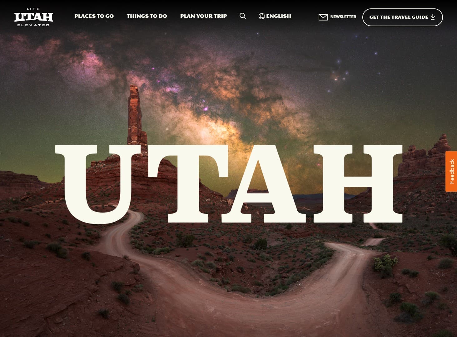
Visit Utah
Responsive site and design system focusing on visually rich pages
- Role
- Lead Frontend Developer
- Tech
- HTML · CSS · Javascript · Webpack · Babel · GSAP · Sass
- Links
- Live site ↗
The goal of redesigning the Visit Utah experience was to create a robust design system focused on empowering content editors with a deep kit of composable, reorderable components for building visually rich, story driven pages without needing a developer for every new layout.
Team
My Role: Lead Frontend Developer
Full Team (as far as I can recollect):
- 1 Internal Product Owner
- 1 Client Product Owner
- 2 Project Managers
- 2 Designers
- 3 Internal Devs
- 1 Partner Agency Dev
- Content Migration Team
FE Tech/Tooling
On this project, most of the frontend mocks and development were done in a separate folder within the project, with the frontend tooling involving a build system using webpack and npm, along with sass, babel, browsersync, handlebars, and GSAP (Green Sock Animation Platform). The goal of this was to have a FE environment that operated independently of the actual site, so as not to be impacted by any backend efforts or beta environment issues.
The general naming convention was BEM (Block Element Modifier), and the general approach was to set up the frontend so that each component in the design system was a block that would include a handlebar partial containing the markup, a sass partial containing all relevant styles, and if necessary, a javascript partial that would contain all relevant js for frontend purposes.
Key Features
- Large design system with a variety of components focused on both text copy and interesting media displays
- Custom parallax page layouts that allow for a large number of components and allow reordering of components as necessary for narrative pages while allowing for complex scroll interactions
- Robust card system allowing for grids, lists, and carousel displays of a wide variety of content from articles, itineraries, locations, activities, events, and others I'm sure I'm forgetting
Challenges
- The Backend Tech Lead (and primary dev on all client discussions) left the company for a new opportunity right before the start of dev, causing a lot of lost context for dev decisions
- Dev started on this project as the pandemic started, so this became the first fully remote site build this team had done.
- The goal of the design system and cms setup of this site was to allow content editors a tremendous amount of creative freedom in terms of page layout and content display, to such an extent that custom sections were created that could contain components and alter said components visual display based on the type of section used. There were 4 custom sections, which meant each component could technically have up to four different looks based on what section it was put in.
- Most of the comps were produced as pages and content types without a serious focus on a single source of truth for individual components, causing some confusion regarding what exactly said 'truth' was during the dev and QA process.
Takeaways
Overall, the project ended up being successful and launching without major issues, and the team managed to overcome most of the initial obstacles, but there were plenty of 'learning opportunities' - in this case, the need for more robust initial project documentation during creative and client discussion phases, as well as to consider just how much creative freedom content editors truly need.
The loss of the the only dev to be in all client meetings and the lack of a true single source of truth for the design system, alongside the substantial variety of component colorways, configurations and display options combined to fully exposed the importance of needing more documentation on a project of this scope to avoid the degree of context loss that occurred on this project, as well as suggesting that reoccurring design system audits probably need to take place during the design phase to avoid scope creep.